CSS Basic Terms and Definitions
CSS stands for Cascading Style Sheets. CSS describes how HTML elements are displayed in a browser window. The biggest advantage to using CSS is saving workload for the developer. Rather than styling on the fly for every HTML element, we can create CSS classes to do it for us. CSS stylesheets are stored externally to the web page and linked via in the <head> tag of the web page.
<head>
<:link href="css/main.css" rel="stylesheet" type="text/css" />
</head>
Usually CSS files are kept in a separate folder on the web server; most commonly called, “css”. The CSS file is then linked to the HTML file with the <link> tag. The “rel” means relationship and in this case a stylesheet. The syntax type=”text/css” signifies that the content is CSS.
One web page could look infinitely different with changes to the CSS file. Colors, font sizes, layouts, borders, margins, padding, images, links, buttons, and so much more can be modified from the CSS file.
CSS files are extremely robust and make every web page/website unique. It’s like the DNA to the website. One change to an element within the CSS file can change the website a little or drastically.
<p class="red-text">Here is some red text.</p>
Here is some red text.
The “p” part of the above references that it’s a paragraph. The “class” part tells us that there is a specific style to the paragraph and that selector is called “red-text”. The name can be any name we choose, but it helps to give it a name that means something to where it will be applied.
The CSS file that relates to the above code would look something like this:
.red-text { color: red; }
/* comments */
The “/* comments */” syntax (the word “words” would be replaced with other text) is very useful to add descriptions to our code. The computer or browser ignores what is inside the “/*” and the “*/” brackets. Humans can read it when looking at the code to dcypher what the next bit of code does. I like to use it for the font families we are using and the colors we have picked for our color scheme. As well I use it throughout the file to document what the next set of code is for. The text is grayed out so you know it is a comment.
/* Here is some text to tell me what the next few lines are for */
.resource-title {
display:block;
background-color: blue;
color: white;
}
There are hundreds of terms pertaining to CSS. It doesn’t serve any purpose to go through all of them if you do not know how to use them. I will go through some of them here. I would rather cover a few concepts that pertain to CSS than to just list definitions. There is a more complete list of CSS terms in Appendix A - CSS Properties.
Concept: Font Styling vs. Text Styling
It isn’t uncommon for newbies to be confused between styling fonts and styling text. They both pertain to letters and words. An easy way to remember the difference is that font styles affect the shape of the characters, whereas text styles affect the layout or visual presentation of the text.
Here are some common font styles that will affect how the font looks:
font-size: Controls the size of the font.
font-family: Designates the name of the font.
font-style: Designates if inherit, italic, normal or oblique.
font-weight: Designates how heavy (bold) or light the font is.
font-variant: Designates if inherit, normal or small-caps.
font-size-adjust: Inherit or none.
font-stretch: Many options from condensed to expanded.
Common text styles that affect how the text will look on the web page:
text-align: Aligns the text left, center or right.
text-decoration: Options to underline, overline, line-through, blink and more
text-indent: Idents the text
text-justify: Justifies the text across the browser window. Some
options adjust the word spacing and/or the character spacing to justify the text.
text-outline: Outlines the text.
text-overflow: Specifies how overflow text should be signaled to the visitor.
text-shadow: Adds a shadow to the text.
text-transform: Changes the text to uppercase, lowercase, capitalize, none or inherit.
text-wrap: Specifies to the browser to break a line of text, usually for unusually long
words in a small container.
Concept: Padding vs. Margins
A couple of commonly used properties are padding and margin. A margin is the space between elements. Padding is the space within the element. Here is a visual to distinguish between margins and padding. If we want spacing between two elements, we use margins. If we want spacing for content within the element, we use padding.
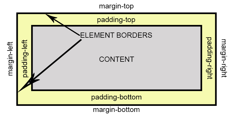
Margins - control the spacing outside of an element.
Padding - controls the spacing inside of an element.
Each can be set individually by using -top, -right, -bottom, -left after margin or padding. If we want all four sides to be the same spacing, we just use either margin or padding.
We can also set the properties as follows:
{ margin: 20px 5px } Using two numbers, the first represents top and
bottom margins and the second number represents left and right margins.
{ margin: 20px 0 10px 0 } Using four numbers, you start at the top and work
clockwise around the element. In respective order, these numbers represent top, right,
bottom, left margins or padding.
You can have a lot of fun with margins and padding by using negative margins. Using negative margins is a bit beyond the purpose and scope of this book.
Concept: Borders
Borders are a great way to separate elements on a web page. There are many ways to style borders. Like with margins and paddings, you can make unique and fun borders.
- border-width: specifies the thickness of the border. It can be done with a numeric value measured in px, em, rem, vh and vw units.
- border-style: specifies the line type around the element. Values include solid, dashed, dotted, double, groove, ridge, inset, outset.
- border-color: specifies the color of the border.
- border-radius: adds a rounded corner to the border. The larger the px value, the greater the rounded corner will be.
- border-image: adds an image around an element instead of a line.
Concept <id> vs. <class>
The <id> and <class> is used through a web page and it is important to know when to use each term.
<div class>
Assigns attributes that are used for several elements. If we want to style some text in different parts of the website to be a certain font-size or color or font-family, we create a class for that text.
.text-large {
font-family: 'Nunito', sans-serif;
font-size: 18px;
color: green;
}
<div id>
Assigns attributes to a specific element with the page. We want an element block to have a certain look to it and we only plan to use that element once, we would create a <div id> for it. For example, a signup section for a website, maybe we want it to have a gray background with a black border and space it 20px from the element above and below it.
#sign-up {
background-color: gray;
border: solid 1px black;
margin: 20px 0;
}
Note: <div class> names start with a period (".") and <div id> names start with a pound sign ("#")
Concept: Navigation Lists
In the HTML definitions, it is stated that the proper way to do navigation is with an unordered list. Navigation lists can either be horizontal or vertical. Sometimes tricky to get them to do what you want, but with careful set up, you can make them look and function nicely. There is an infinite number of ways to style a navigation bar. Below is a basic structure to a horizontal navigation bar.
- nav: Distinguishes the navigation area. You can change background colors, padding, etc.
- nav ul: Distinguishes the entire list area. You can set the margin, position, list-style for the navigation.
- nav ul li: Distinguishes the list item area. You can set the display for the list. For a horizontal navigation, the display is set to "inline-block".
- nav a: Sets the style for the links within the navigation. There are several
"states" that links can be in.
- a:link - a normal link that hasn't been visited
- a:visited - a link that a visitor has clicked on already
- a:hover - when a visitor hovers the mouse over the link
- a:active - a link the moment it is clicked by the visitor
When writing the CSS code for links, the order is important. The line of code takes precedence over the style rules prior to it. So the order above, (link, visited, hover and active) is how they should be listed in the CSS file.
For more advanced horizontal navigation, let's add a dropdown to the navigation bar.
- nav ul ul: Sets up the list for the first tier dropdown.
- nav ul ul li: Distinguishes the list items for the first tier dropdown.
- nav ul ul ul li: Distinguishes the second tier dropdown.
nav {
background-color:blue;
}
nav ul {
list-style:none;
margin:0;
padding:0;
position:relative;
}
nav ul li {
display:inline-block;
}
nav a {
display:block;
padding:0 10px;
color:#fff;
line-height:50px;
text-decoration:none;
text-transform:uppercase;
}
nav a:hover {
background-color:#999;
color:#000;
}
/* Hide Dropdowns by Default */
nav ul ul {
display: none;
position: absolute;
top: 50px; /* the height of the main nav */
}
nav ul ul a {
}
/* Display Dropdowns on Hover */
nav ul li:hover > ul {
display:inherit;
}
/* First Tier Dropdown */
nav ul ul li {
float:none;
display:list-item;
position: relative;
background-color:blue;
}
/* Second, Third and more Tiers */
nav ul ul ul li {
position: relative;
top:-60px;
left:220px;
}
The above CSS code would produce the following navigation bar.
Under the "Services" tab, there is a dropdown menu to add additional services. By default, you do not see the dropdown list, but if you hover your mouse over it, the list would be visible.
Concept: Making Buttons
Buttons are used in websites to implement an action. It can be like a switch and turn things on or off, or to show or hide something, or to navigate the visitor like a link. You would use the ".button" class to create a button, but if you want different color buttons, then create a new class like, ".button-red" for a red button. The basic attributes for making a button are:
- background-color: sets the background color.
- border: determines if there is a border, what color it is and how thick it is.
- border-radius: adds rounded corners by pixel size (ie: 2px is slight rounded, 20px is very rounded).
- color: text color within the button
- padding: good idea to set the padding within the button
- text-align: most people like the text to be centered within the button
- text-decoration: it is common to set this to "none" so that there is not an underline in the button, but it's all up to the creator of the button.
- display: usual set to "inline-block" if you would like to have buttons next to each other.
- font-size: sets the font to the size you would like.
- margin: sets the spacing around the button.
- cursor: how you want the mouse cursor to look when it hovers over the button.
There are many more advanced ways to style buttons like, transitions, icons within the buttons, animation and more. With the above styles you can make professional looking buttons for your website. Here are two examples, a default button and the same button with some style:
Here is the CSS for the 2nd button:
.button1 {
background:yellow;
border:solid 1px black;
border-radius:4px;
color:black;
padding:4px 8px;
text-align:center;
font-size:1em;
margin:0 10px;
cursor:crosshair;
}