Part II - Preparation
Organization is key is really any project you do. Websites are no different. It has taken many websites for me to come up with this plan. So far, it has been the most effective way for me to keep things organized and on track. The steps below is what I do when I am starting a new website. Every website I do, I do this way.
Step 1: Plan the Layout of the Website
I like to use Photoshop for laying out how I want my website to look. But I am assuming that most people don’t have the Adobe Photoshop program. My second method is to use MS Excel or Google Sheets to layout my web pages and most people have access to these programs. It’s easy to move things around, resize items, add images if that helps. Depending on your Excel skills, you can layout the whole web page without even doing any coding.
Here is a sample layout for the adventure camp:
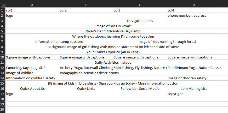
Column A represents the sections of the web page from top to bottom.
Columns B through E represent basic information that pertain to the areas of the web page.
Row 1 I listed what I call, “piers”. When you look at a web page vertically, you can see that the page can be broken down into columns or “piers”. Imagine the pillars holding up a dock. Sometimes information is sorted into two parts, three parts, four parts and more. Using 4 parts is good because it is easy to combine 2 of the parts into one part.
For most websites I create, I like to start with 4 piers. So in Excel, we use columns to represent piers. Some content we will use will span only one column, some span two columns, some span 3 columns and some span across the entire web page or all four columns. There is one section where we are going to use only 3 columns and we will have to set up that area of the page to be 3 piers.
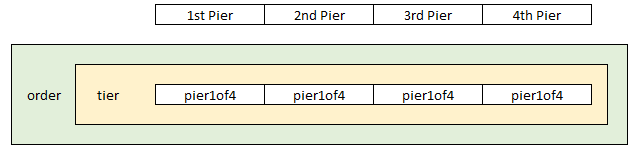
In the first row of the spreadsheet, we list the 4 piers (columns). Each row below the first row represents separate areas of content. Each row represents an order. The order wraps that area of content. Within the order (row) is a tier, which groups the content in the order. Each column in that order represents a pier. Each row must represent 100% of the width of the web page.
Here is a visual example of how these relate to each other:
After we lay out the orders and piers, we can resize the rows, center items, and add some images if we would like. I opted not to add images but resizing the rows gives me a good visual of what we are trying to achieve.
Here is what that could look like in Excel:
Need Screenshot of Excel Spreadsheet
If you don’t have enough experience with Excel, then grab sheets of paper or use Word documents and write out or sketch how you would like your web page to look.
Step 2: Download/Copy/Save Photos to a Temporary Folder
Let’s hope or assume that you have a bunch of images that you would like to use for your website. Either from your phone or computer, move or copy pictures to a temporary folder. This folder is different from the folder we just created. Copy the pictures to the folder versus moving the images there. The images themselves should be high resolution images. But that does come at a price. High-res images means larger file sizes, which means longer loading times. It is recommended to keep a web page’s weight in megabytes under 1-2mb. If your image is already 1mb, that’s half the weight of the web page. So there is a trade off from really nice pictures and Google ranking due to slow load speeds.
I tend to resize my images a bit bigger than my intended use for them. For example, if I plan to use an image as a square image at around 400px x 400px. I will make it 600px x 600px. Mostly to make sure the image doesn’t get pixelated if the visitor is viewing the website on a large browser. In the coding for each image, we will add code to ensure a max-height or max-width for the image, but I still like to have my images a bit bigger than its intended use.
Step 3: Edit your Photos
There are some free photo editing software on the web where you can crop images, change the lighting, and add text. Look at your photos and decide on what photos you want to use where. Many times I make my photos square (800px x 800px) for sections of the web page where there is text next to it. Other times I make the photos long but not too tall for headers or banners (1600px x 350px). I want the image to look good across the entire web page. Sometimes smaller images work better for other areas of the page. It’s all a part of the planning process. Layout on paper where you want elements of the page to go.
Rename or do a “Save as” for your photos and use an SEO-friendly naming structure. Use keywords in the name of your photo. Use hyphens in between words within the name of the image file. Here’s an example:
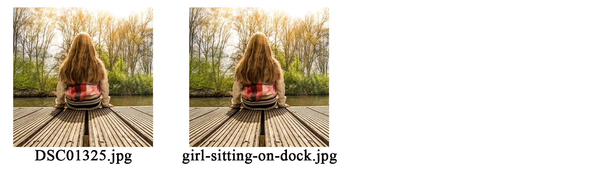
Same image but the 2nd was renamed to be useful when it comes to SEO. Make sure you do this with all the images that you plan to use for your website. You can “save as” in the same folder and then move the images to the “images” folder or you can “save as” directly into the “images” folder for the website.
Step 4: Picking out Colors
Most of us haven’t gone to design school and learned about complementary colors, contrasting colors, etc. Picking out colors for your website is crucial. If you have a logo already, then that is where you start. If you are starting from complete scratch, then research other websites in your industry and see what colors seem to be popular. Since we are creating a website about an adventure camp on a river, we want to use blues and greens. My favorite website to go to for this is: http://www.colourlovers.com/web/trends/websites
There are tons of examples of color schemes to review. Some of the color schemes are from popular websites. This palette happens to be the same palette for Vimeo’s website. When you find one that you like, save it to your computer along with the HEX codes associated with it. I use Snip & Sketch on my Windows 10 computer to snip the colors I want to use and save it to my Desktop. For our example, I picked out the following colors:
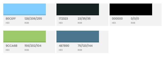
I will use the colors for backgrounds, links, headings, text, etc. If I pick a color for headings, I will keep that color for all headings. We want to be consistent throughout the website.
Step 5: Picking out Font Families
Like with the colors to the website, picking the right fonts can make a website visually stand out. I usually pick 3 or 4 fonts. The place to go for fonts is Google’s own: fonts.google.com
We want fonts that compliment what we are trying to convey. Since this is a kids’ camp website, we want fonts that are somewhat playful without overdoing it. We search through the list of fonts and imagine where we would like to use the fonts. We want a font for headings, a font for content, another font for emphasis, maybe one for quotes.
When you see one you like, click on it and then select the style or styles you like. The styles are mostly with the weight of the font or the boldness, but also with italics too. After you click on the style, click the “back” arrow to go back. We want to download all of them at the same time. Once we have all the fonts we want, then click the “Embed” at the top-right of the screen.
Copy both the <link> and the CSS rules to specify families. Paste them in a Word Doc or Notepad file, we will need them soon. Below is what I saved for this website:
<link href="https://fonts.googleapis.com/css2?family=Archivo+Black&family= Concert+One&family=Merriweather:wght@300&family=Roboto&display=swap" rel="stylesheet">
font-family: 'Archivo Black', sans-serif; - h1 heading
font-family: 'Concert One', cursive; - comments, quotes
font-family: 'Merriweather', serif; - documents, forms
font-family: 'Roboto', sans-serif; - content, paragraphs
NOTE: I added some text next to the font-families so I know which fonts I want to use and where.
Step 6: Create the Folders for the Website
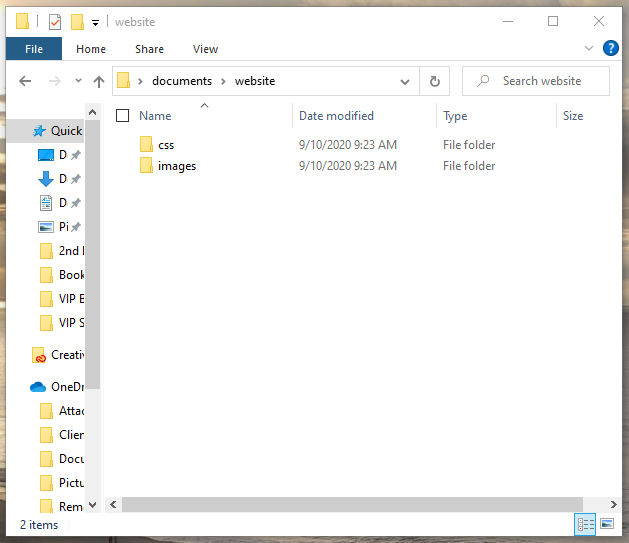
Create 3 folders on your computer, preferably in “Documents” folder but can be on the desktop. First folder named “website” (no quotes). Open “website” folder and create another folder called “images”. Still inside the “website folder, create another folder called “css”.
Below is what both folders should look like:
Step 7: Create a new HTML and CSS file
- Go into your website folder that you created earlier (double-click website folder).
- Right click in the window and create a new text document.
- On the first line of the text document, type: <html>
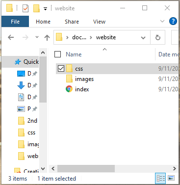
- Go to File and then Save As, change the file extension from .txt to All Files and rename it “index.html” (no quotation marks)
- Delete the “New Text Document.txt” file.
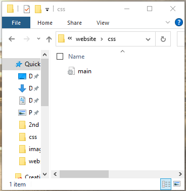
- Double click the ‘css’ folder
- Right click in the window and create a new text document.
- On the first line of the Notepad document, type: “/* Default CSS */” (no quotation marks)
- Go to File and then Save As, change the file extension from .txt to All Files and rename it “main.css” (no quotation marks).
- Delete the “New Text Document.txt” file.
You should have the following:
NOTE: The reason we called it, “index.html” is to let the web server know that this is the homepage for the website or the first page to load in that directory of files.
If you have downloaded a free HTML editor, then the above process is very easy. We are going to continue as if all we have is the plain text file. To edit each document, you will need to open each document in Notepad or any other HTML editor.
Step 8: Laying out our CSS code
A complete view of the CSS code for this project is in Appendix “D”.
What we are going to start typing out is some housekeeping stuff. I save this file in a separate folder for future projects so I don’t have to retype it each time I start a new website.
Open your “main.css” in your editor and begin typing out the following items.
@charset "utf-8";
/* Default CSS */
/* FONTS
font-family: 'Archivo Black', sans-serif; - h1 heading
font-family: 'Concert One', cursive; - comments, quotes
font-family: 'Merriweather', serif; - documents, forms
font-family: 'Roboto', sans-serif; - content, paragraphs
*/
/* COLORS
#80CEFF; - Light Blue
#4B7890; - Darker Blue
#9CCA68; - Green
#172323; - Dark Grey
#000000; - Black
*/
#wrapper {
}
body {
}
h1 {
}
h2 {
}
h3 {
}
p {
}
/* PIERS */
/* Columns of content across the page */
.pier {
display: block;
float:left;
margin: 1% 0 1% 1.6%;
}
.pier:first-child { margin-left: 0; }
/* ORDER */
/* Contains the Tiers and Piers */
.order:before, .order:after { content:""; display:table; }
.order:after { clear:both;}
.order { zoom:1; /* For IE 6/7 */ }
/* Four Piers */
.pier4of4 { width: 100%; }
.pier3of4 { width: 74.6%; }
.pier2of4 { width: 49.2%; }
.pier1of4 { width: 23.8%; }
/* GO FULL WIDTH BELOW 480 PIXELS */
@media only screen and (max-width: 480px) {
.pier { margin: 1% 0 1% 0%; }
.pier1of4, .pier2of4, .pier3of4, .pier4of4 { width: 100%; }
}
/* End Four Piers */
/* Three Piers */
.pier3of3 { width: 100%; }
.pier2of3 { width: 66.13%; }
.pier1of3 { width: 32.26%; }
/* GO FULL WIDTH BELOW 480 PIXELS */
@media only screen and (max-width: 480px) {
.pier { margin: 1% 0 1% 0%; }
.pier3of3, .pier2of3, .pier1of3 { width: 100%; }
}
/* End Three Piers */
Save it. What we are doing is organizing our CSS file to make it easier to reference later. We will add a lot more to this CSS in later steps.
Step 9: Laying out our HTML Code
Let’s jump over to the HTML file that we have called, “index.html”. Open to edit the “index.html” file and do some housekeeping there. Most of it should look familiar to you.
The first <:link> element links our CSS to the HTML file. The second <link> element links the fonts we chose from Google Fonts to our web page. Go to the Wordpad file that we created for the fonts and the colors and copy and paste from there.
Finally we add the <title> tag with the name of the web page.
Type in the rest of the code below:
<!DOCTYPE html>
<html lang="en">
<head>
<meta charset=”UTF-8”>
<meta name=”title” content=”River Bend Adventure Camp”>
<meta name=”viewport” content=”width=device-width, initial-scale=1.0”>
<meta name="MobileOptimized" content="320">
<link rel="stylesheet" type="text/css" href="css/main.css" media="screen" />
<link href="https://fonts.googleapis.com/css2?family=Archivo+
Black&family=Concert+One&family=Merriweather:wght@300&family=Roboto&
display=swap" rel="stylesheet">
<title>River Bend Adventure Camp</title>
</head>
<body>
<wrapper>
<!-- Logo --> Logo
<!-- Navigation --> Navigation
<!-- Title --> Title
<!-- Header Image --> Header
<!-- Camp information --> Camp Info
<!-- Mission Statement --> Mission Statement
<!-- Child's Experience --> Child's Experience
<!-- Daily Activities --> Daily Activities
<!-- Your Child's Safety --> Your Child's Safety
<!-- Sign Up --> Sign Up
<!-- Footer --> Footer
<!-- Mast --> Mast
</>
</body>
</html>
OK, our housekeeping is done now. Highly important in any document that you are working on is to save as you go. Save both CSS and HTML files now. If you want to see a preview of what we did so far, close the file and then double-click on it and it should open in a new browser window.
All the sections are listed side-by-side across the top of the window. This is because we haven’t done any styling to the html page. I do not type any text next to the comments for each section. This is just an exercise to see a preview of the web page.
The code above should look familiar to the MS Excel spreadsheet that we put together already. Each row on that spreadsheet represents an order or section of the website. This gives us the ability to quickly see what order we are working on at the moment and to see what orders still need to work.
Step 10: Filling in our Orders
In my book, Step 10 is still a part of Part II - Preparation, however for the website, I opted to make Step 10 its own Part. It is Part III - Writing the Code.